
DBMCI One Notes

Transforming Medical
Note-taking for NEET Aspirants

DBMCI One Notes

Your study companion for NEET PG, INI-CET & FMGE

DBMCI One is a dedicated notes app for medical students preparing for NEET PG, INI-CET, and FMGE exams. Created for e-Gurukul, the app offers access to all 19 subject notes aligned with DBMCI One video lectures

It includes tools like annotations, highlights, tags, bookmarks, and AI-powered assistance, making it an all-in-one revision and study companion.

Client

Neuroglia Health Private Limited

Year

Dec 2024 — Early 2025

Platform

iOS & Android

My Role

UI/UX Design,
Research,
Testing

Understanding The Problem

The Ask from DBMCI (via e-Gurukul):
DBMCI wanted to create a streamlined, user-friendly version of Noteshelf specifically for medical students preparing for competitive exams. Their key requirements included:

  • Secure access control for digital books, based on student enrollment
  • Essential study tools such as annotations, tagging, and highlights for active learning
  • A clean, branded interface that aligns with DBMCI's identity
  • A faster, more minimal version of Noteshelf, with features tailored to the study needs of medical students
Hands holding a tablet showing DBMCI One Notes
Product Goal

Students needed a dedicated, reliable, and easy-to-use app to access & manage all their study notes in one place.

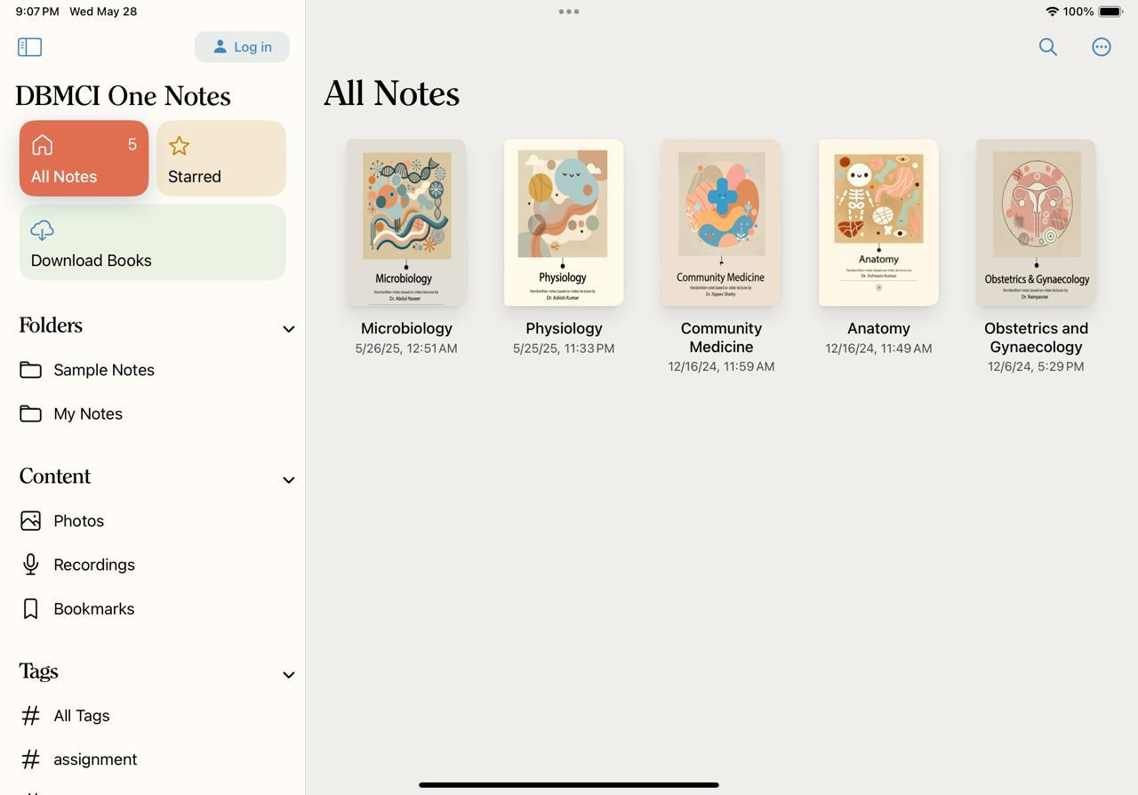
DBMCI One Notes on iPad

My Responsibilities

I led the design process for DBMCI One from start to finish. Conducting user research, defining flows, and designing wireframes, UI screens, and prototypes. I built a scalable design system, collaborated closely with stakeholders and developers, and led testing cycles to deliver a polished, user-friendly final product.

Initial Research

  • To understand user needs, I analyzed existing data from Noteshelf, conducted stakeholder interviews with the DBMCI team, and performed a competitive analysis of other medical prep apps.
  • Additionally, I researched how enrolled students typically engage with digital learning tools to ensure the app would meet their study needs effectively.

Our Users

Primary Users

Medical students preparing for competitive exams like NEET PG, INI-CET, and FMGE. These students are typically in their mid-20s, balancing rigorous academic schedules with exam preparation. Before diving into the design process, I conducted an in-depth analysis of the existing user behavior and engagement data to gain a better understanding of their needs.

We focused on understanding the core problems our users face during their preparation and how the DBMCI One app could become an essential tool in solving those problems.

Aakash

Aakash (NEET PG Aspirant)

A 24-year-old medical student balancing studies with part-time work. He prefers using digital tools for efficient study

Primary Goal "I need quick access to my notes without unnecessary steps. I can't afford to waste time navigating"

Priya

Priya (FMGE Aspirant)

A 25-year-old student preparing for FMGE. She values organized digital tools for structured study

Primary Goal "I need my notes organized by subject and semester so I can focus on what's most relevant for my study plan"

Arjun

Arjun (NEET PG Aspirant)

Arjun, a 24-year-old NEET PG aspirant, juggles lectures and study sessions and needs an all-in-one app to manage his study materials efficiently

Primary Goal "I just want one app where I can download all my study materials and easily highlight, take notes, and bookmark everything, all in one place."

User Insights

To better understand our users, I gathered insights through research and conversations with students. Here's what stood out:

  • Students often study while commuting or between classes, so they need quick access to their notes.
  • They prefer clear, well-organized study materials that are easy to follow.
  • It's important for them to open and use their materials without too many steps or confusion.
  • They like using tools like AI, bookmarks, and highlights to make revision easier.
  • Most students want a single app where they can download their study materials and also write, highlight, and organize everything in one place.

Defining the Core Flow: Accessing Digital Books

The Challenge

How do we let only eligible students (those who paid fees) access the course materials, seamlessly?

Iteration 1

We first considered using a unique user ID or code-based access. But students found this confusing and difficult to remember each time they needed to log in or download books.

Iteration 2

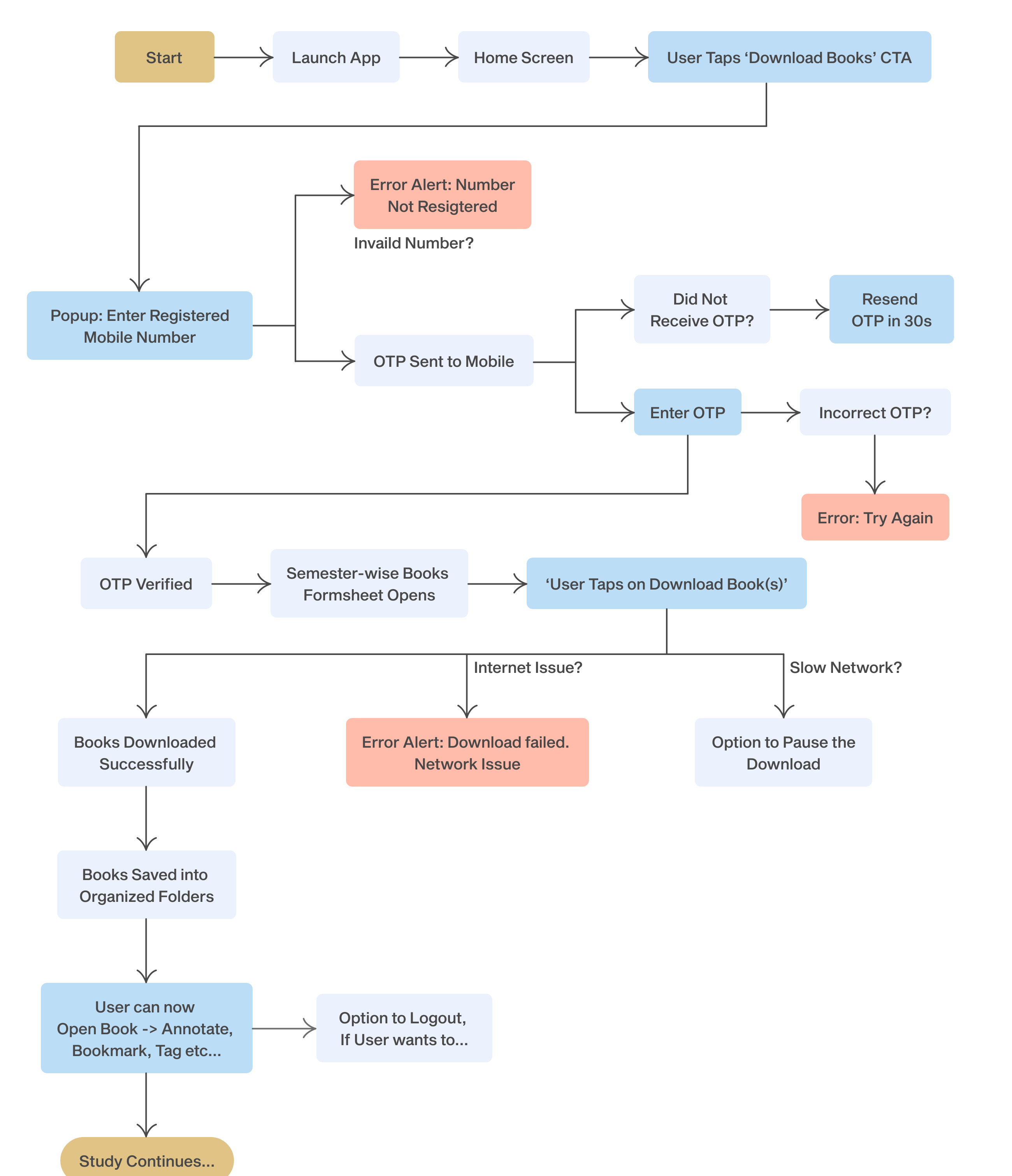
Since the first approach felt complicated and hard to use We simplified the login flow in Iteration 2. The new solution used OTP-based access through the student's registered mobile number. The idea was approved, and after a round of brainstorming, we shaped the final flow.

Final Flow

Below was our proposed flow

DBMCI One download flow chart

Designing the Experience

After getting the green light on the flow, I moved on to UI and branding.

What I did:
  • Created wireframes and clickable prototypes
  • Designed a minimal interface optimized for iPads & tablets
  • Built a clean design system with reusable components (buttons, modals, list items, etc.)
  • Used the brand colors provided by the client while maintaining consistency with Noteshelf's UX patterns

Sketches & Early Designs

A sneak peek into my early wireframes, mid-fidelity screens, and drafts. I focused on getting the user flow right early on, so there weren't too many iterations. However, every design decision was validated against real use cases to ensure clarity, consistency, and ease of use especially on a tablet device.
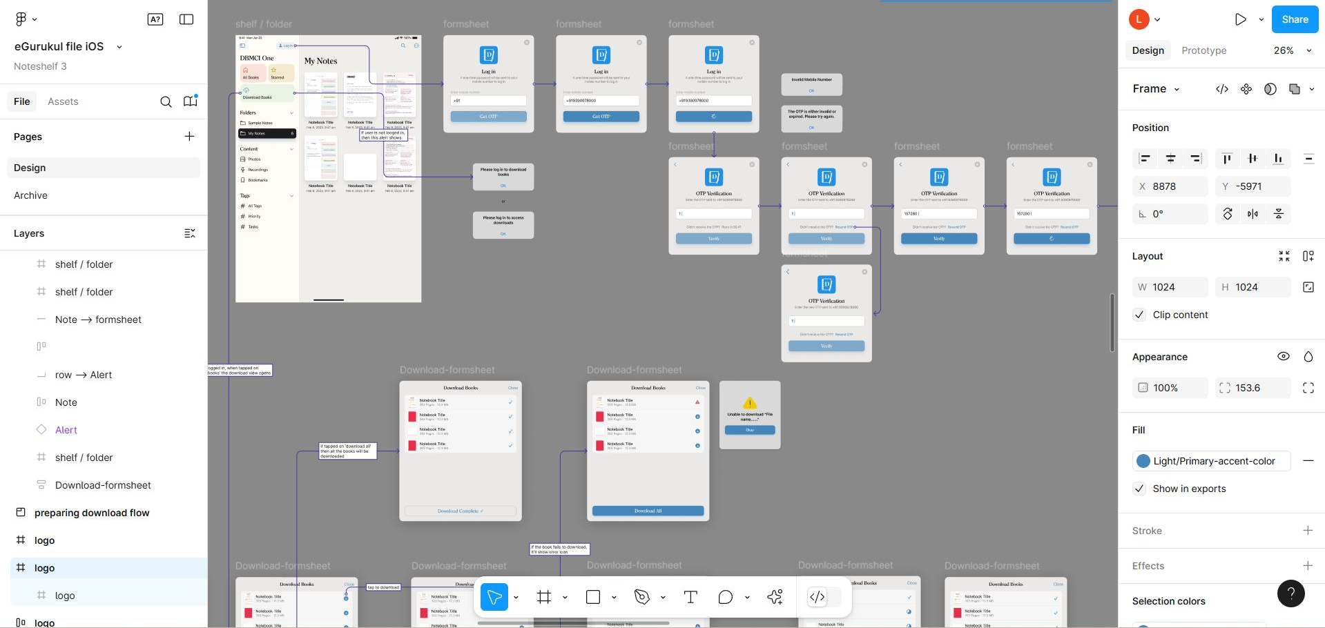
Figma file showing early wireframes
Hand-drawn sketches

Usability Testing

Once the prototype was ready, I shared it with the DBMCI team for real-world testing with medical students. The feedback was positive. Students found the flow intuitive and easy to navigate. With no major usability concerns, we moved forward to final UI design, branding, and development handoff.

The Feedback from NEET PG Students

"The flow made sense. I liked that I didn't have to remember any IDs or codes"

"Everything felt smooth. I didn't need anyone's help to figure out how to get started"

"Finally, one app that does everything! I could login, find my books and start studying & annotating without any confusion"

The feedback was really positive. Students found the flow simple and said it made their study process smoother. Once I knew we were on the right track, I moved on to refining the branding and visual design to align the experience with DBMCI's identity.

Branding

Although it was a white-labeled version of Noteshelf 3, I ensured:
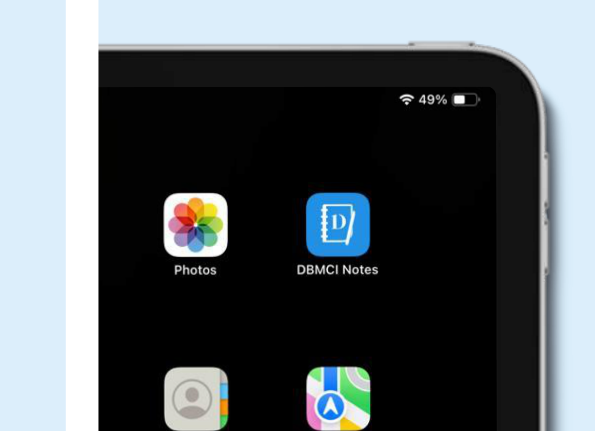
  • The color palette and logo reflected DBMCI's visual identity
  • The design reflected DBMCI's academic identity while maintaining a clean, focused interface for seamless studying.
  • And the design was consistent across iOS and Android
DBMCI One Notes icon
DBMCI One Notes icon on iPad home screen

Color Palette

Azure Blue
HEX #4587BA RGB 69 / 135 / 186
Sky Blue
HEX #56A9E8 RGB 86 / 169 / 232
Terra Cotta
HEX #E05E51 RGB 224 / 94 / 81
Mustard
Yellow
HEX #E7B545 RGB 231 / 181 / 69
White
HEX #EBE8E8 RGB 235 / 232 / 232
Dark Gray
HEX #1C1C1C RGB 28 / 28 / 28

Tints

Azure Blue 900HEX #152838RGB 21 / 40 / 56Black 900HEX #000000RGB 0 / 0 / 0Light Grey 900HEX #666666RGB 102 / 102 / 102
Azure Blue 800HEX #1F3B51RGB 31 / 59 / 81Black 800HEX #0F0F0FRGB 15 / 15 / 15Light Grey 800HEX #808080RGB 128 / 128 / 128
Azure Blue 700HEX #295170RGB 41 / 81 / 112Black 600 BaseHEX #1C1C1CRGB 28 / 28 / 28Light Grey 600HEX #999999RGB 153 / 153 / 153
Azure Blue 600HEX #376C95RGB 55 / 108 / 149Light Grey 700HEX #B3B3B3RGB 179 / 179 / 179
Azure Blue 500 BaseHEX #4587BARGB 69 / 135 / 186Black 700HEX #262626RGB 38 / 38 / 38Light Grey 500HEX #BDBDBDRGB 189 / 189 / 189
Black 500HEX #404040RGB 64 / 64 / 64Light Grey 400HEX #C8C8C8RGB 200 / 200 / 200
Azure Blue 400HEX #6FB7D6RGB 106 / 159 / 200Black 400HEX #595959RGB 89 / 89 / 89Light Grey 300HEX #D6D6D6RGB 214 / 214 / 214
Azure Blue 300HEX #8FB7D6RGB 143 / 183 / 214Black 300HEX #737373RGB 115 / 115 / 115Light Grey 200 BaseHEX #EBE8E8RGB 235 / 232 / 232
Azure Blue 200HEX #B5CFE3RGB 181 / 207 / 227Black 200HEX #8C8C8CRGB 140 / 140 / 140
Azure Blue 100HEX #DAE7F1RGB 218 / 231 / 241Black 100HEX #A6A6A6RGB 166 / 166 / 166Light Grey 100HEX #F6F4F4RGB 246 / 244 / 244

Fonts

AaBb
SF Pro
AaBb
Clearface-Serial

Final Designs

The goal was to keep the interface simple and user-friendly while making sure it fit the overall flow of the app. I designed versions for both iOS and Android, along with light and dark modes to ensure the app feels accessible and comfortable no matter the user's preference.

Below, you can see the final designs
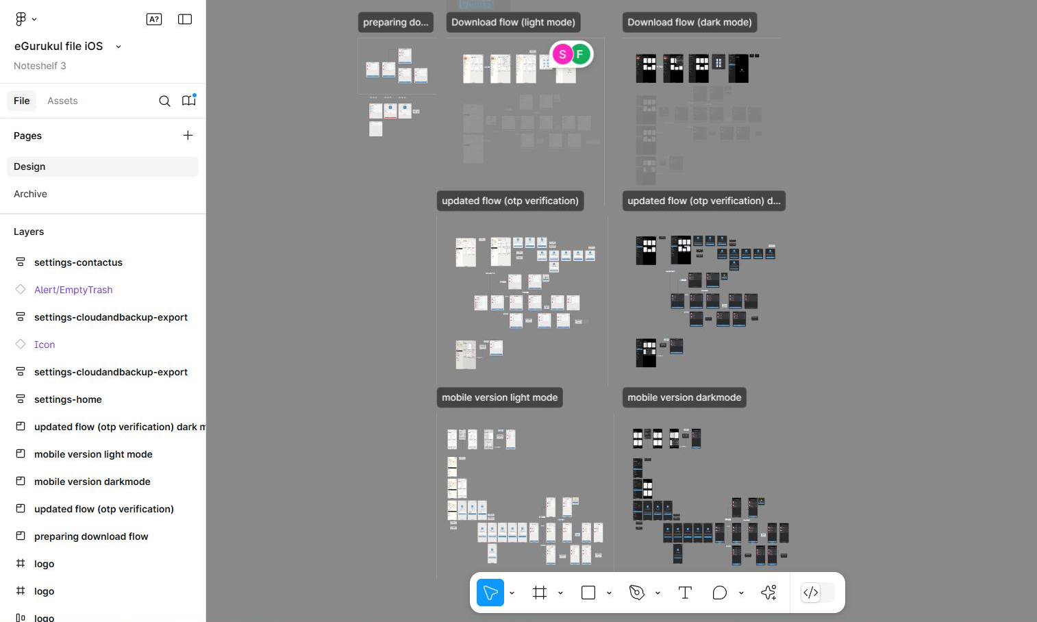
  • iOS and Android versions: Tailored to each platform's design standards while keeping the core experience consistent.
  • Light and Dark modes: Offering users a choice for better usability, whether in bright or low-light environments.
  • Key features: Seamlessly integrated functions like annotations, book downloads, and easy navigation for a smooth, uninterrupted study session.
Figma file showing UI designs for mobile and iPad

Figma file showing UI designs for mobile and iPad.

Home Screen (Shelf)

Since the app is built on Noteshelf, we kept the familiar layout but removed features that weren't essential for DBMCI students. The goal was to make it feel focused, easy to use, and helpful for learners managing a heavy study load.
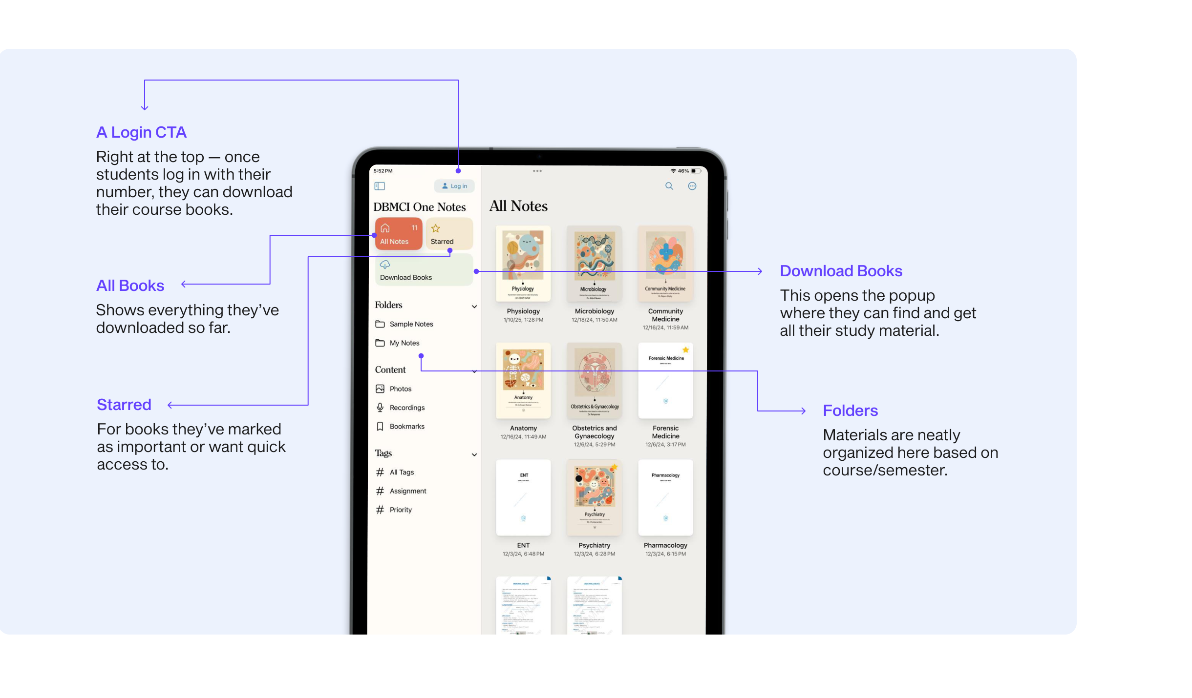
Annotated home screen
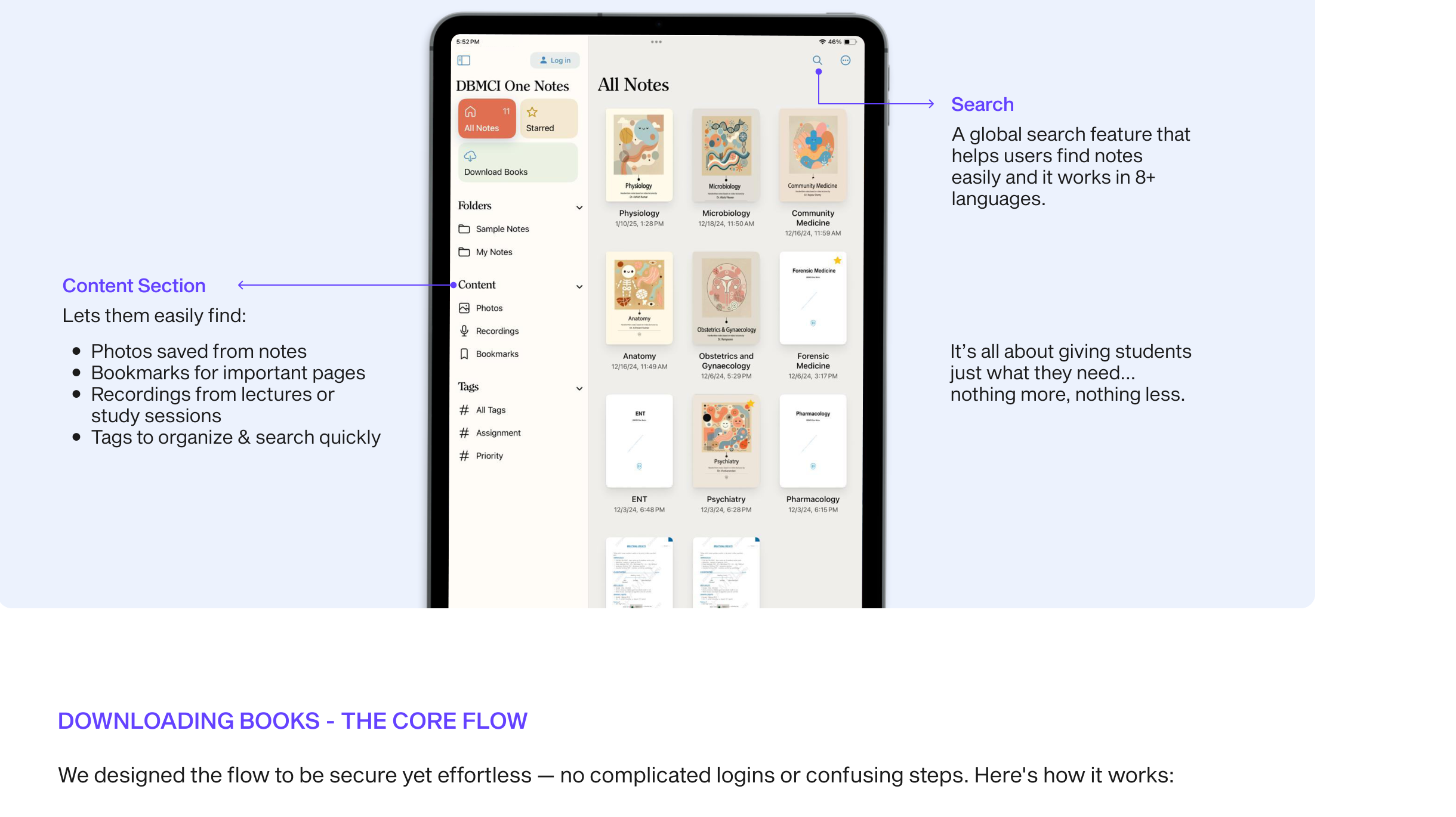
Annotated content section with search
Downloading Books — The Core Flow

We designed the flow to be secure yet effortless — no complicated logins or confusing steps. Here's how it works:
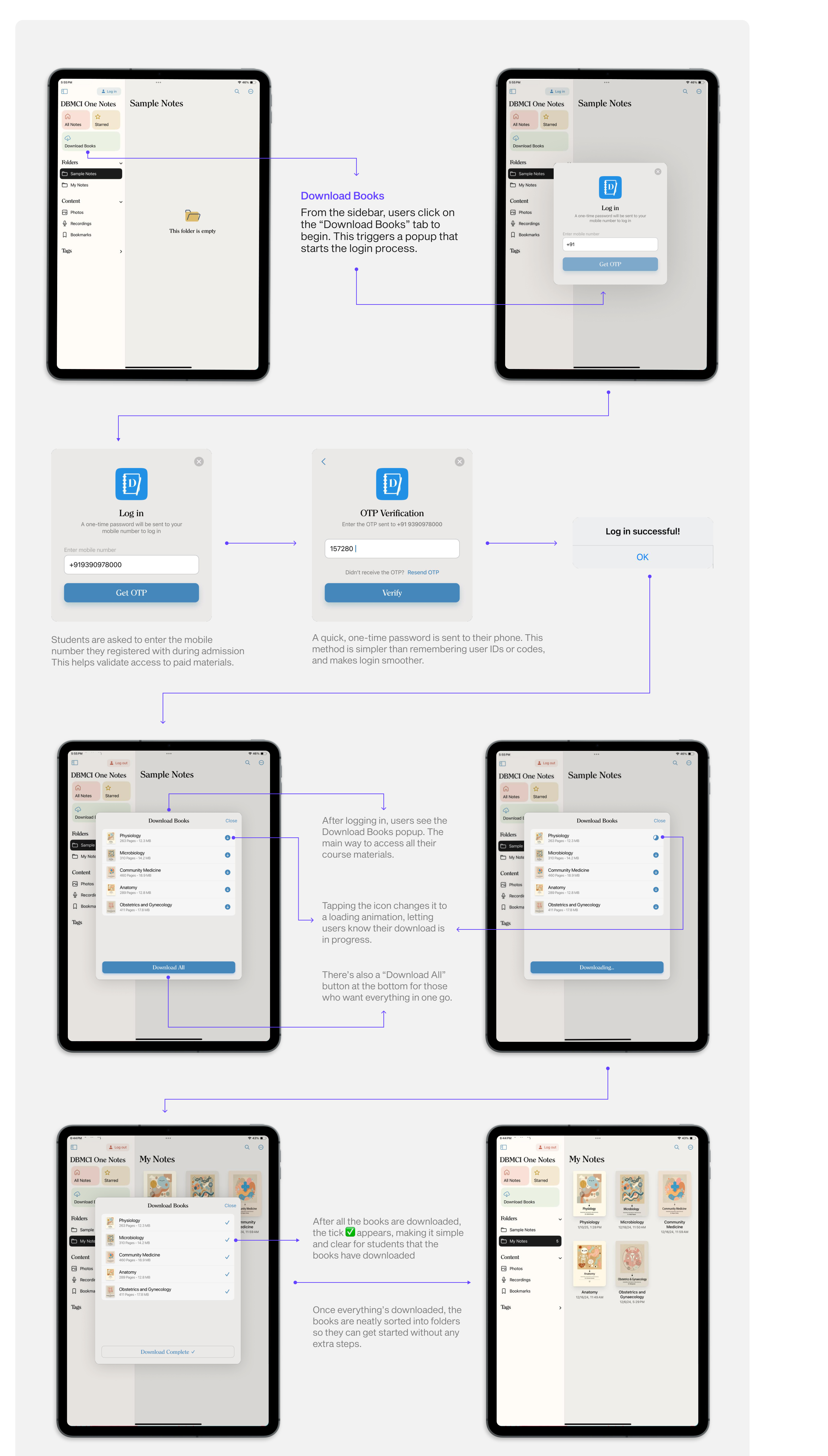
Download books flow
Handling Edge Cases

Designing for real-life scenarios meant planning for things that could go wrong too:
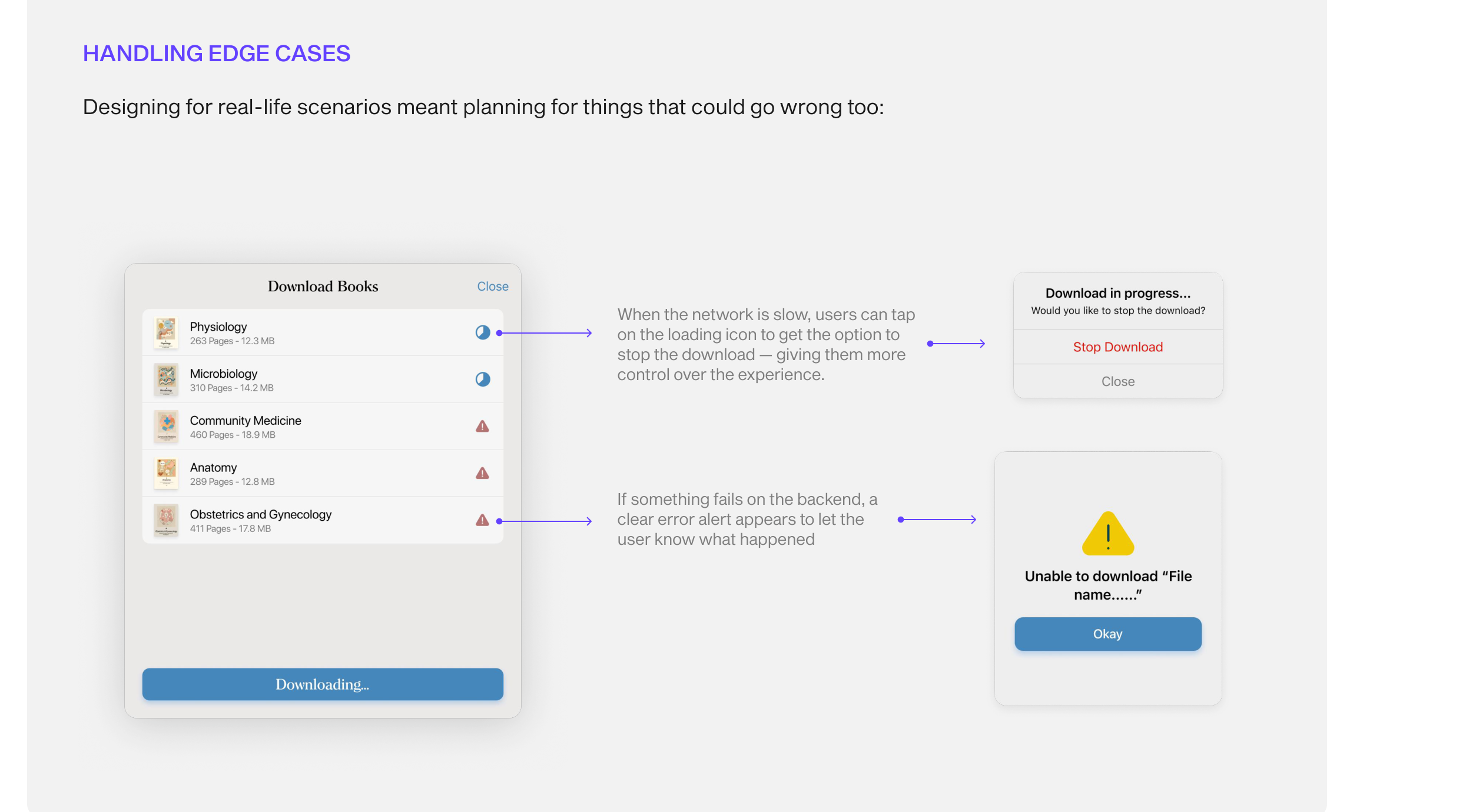
Edge cases for download
After Download: Study, Annotate, Repeat

Once the books are downloaded, students can open them up and get started. Just like a real notebook, but way more flexible.
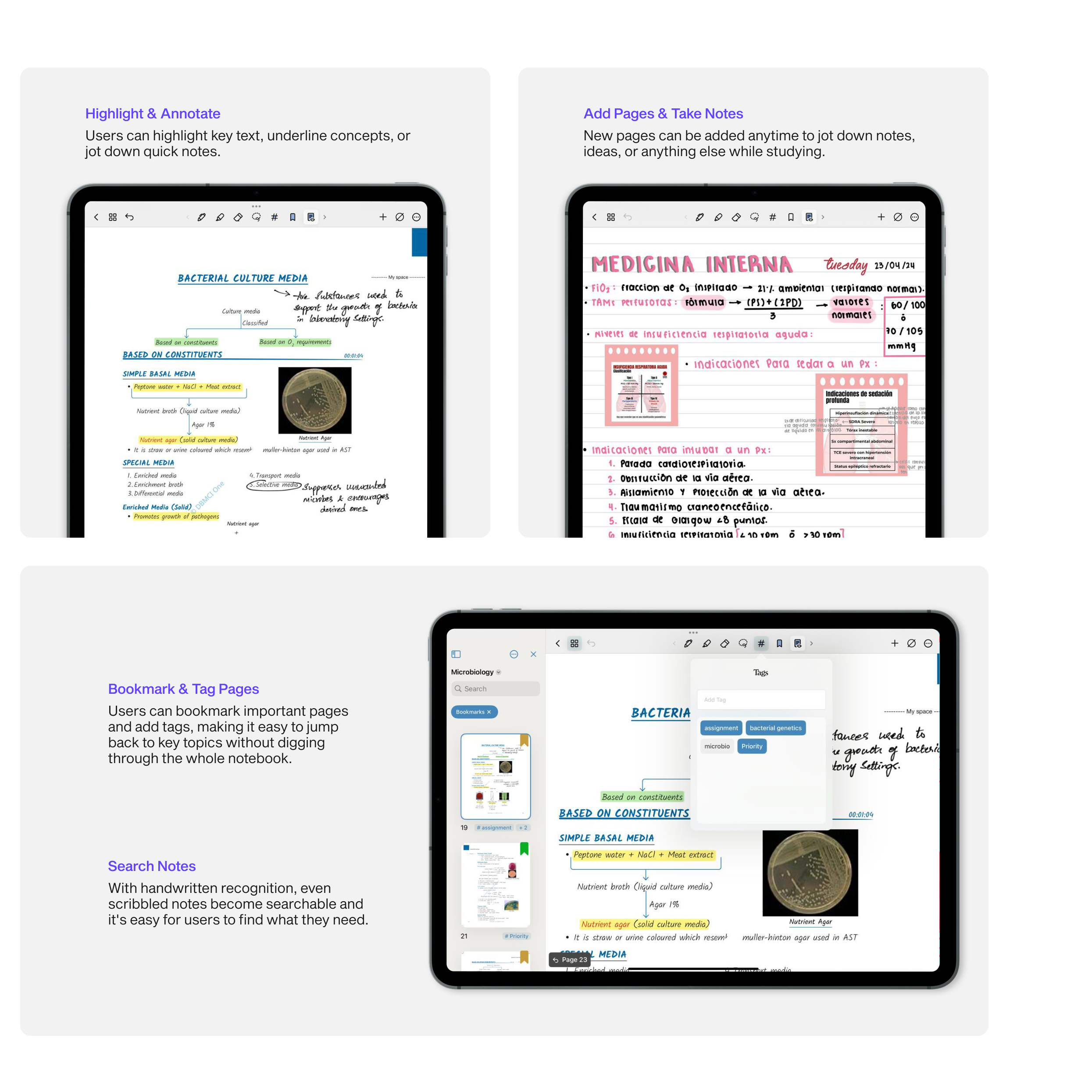
Highlight, annotate, bookmark and search features

Testing & Iteration

Once development was complete (2-3 days), I:

  • Conducted rigorous QA testing of the app build
  • Logged bugs in Notion with clear reproduction steps, screenshots, and priorities
  • Collaborated with the developer to fix and retest until we reached a stable release

With every round of testing, we made the app more stable and intuitive, ensuring students had a reliable tool to study without distractions.
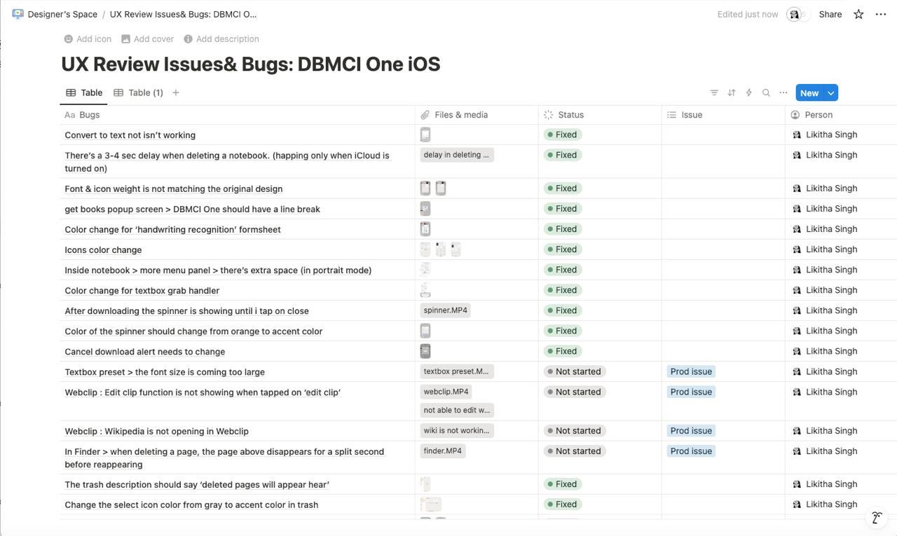
UX review issues and bugs tracked in Notion

Detailed list of bugs and usability problems recorded in Notion after testing

Final Outcome

  • The app was successfully launched on iOS and Android platforms.
  • It received positive feedback from both DBMCI stakeholders and early student testers.
  • The simple download-access model made it easy for enrolled students to jump into studying without friction.

What I Learned

  • This project gave me hands-on experience with end-to-end UX ownership—from research to release
  • Collaborating directly with stakeholders made it easier to align business goals with user needs
  • Designing for students who are always focused and short on time taught me how important it is to keep things simple and clear in every part of the experience
  • I learned how to think critically through authentication flows, work with constraints, and deliver a real-world solution under a tight timeline

Future

Bug Fixes & improvements
While most issues were ironed out before launch, there might still be a few bugs to catch and polish as real users start using the product

Post-launch feedback loop
Gathering feedback from students and stakeholders will help us fine-tune the experience and identify any gaps or friction points

Ongoing enhancements
As the product evolves, we aim to keep improving the experience—whether it's better annotation tools, smarter AI support, or even more seamless onboarding

Highlights

  • Created a full authentication flow with OTP-based access
  • Rebranded a white-labeled app with client-provided guidelines
  • Designed a user-friendly reading + annotation experience
  • Built and maintained a clean design system
  • Ran testing cycles, tracked bugs in Notion, and collaborated closely with devs
Final Thoughts

This has been one of the most meaningful projects I've worked on. Grateful for the trust my team placed in me to lead it end to end. Huge thanks to the product and development team for their collaboration and support.

Thank you for reading through! I hope you enjoyed exploring the thinking and design behind DBMCI One. :)
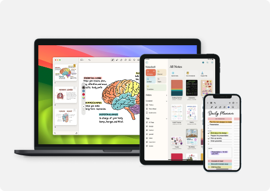
Check out other projects I've poured my heart into :)

Noteshelf 3
NOTESHELF 3

Designing Noteshelf 3: An Intuitive, Cross-Platform Experience for 10M+ Users