Improving Media Content Interaction for 10+ Million Users of Notesehlf 3
Project Overview
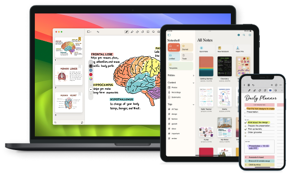
Notesehlf 3 - Content View
In Noteshelf 3, I led the UX design of the Content View, a feature designed to solve a major discoverability problem users faced in previous versions. With Noteshelf being a hub for handwritten notes, audio recordings, images, bookmarks, and tags, users were struggling to find specific content inside large or multiple notebooks.
Content View simplifies this by bringing all media like Photos, Recordings, Bookmarks, and Tags into centralized, searchable sections.
Likitha, Angela,
Anuja & Nikita
Early - 2023
iOS & Android
UI/UX Design,
Research,
Testing
The Problem
In Noteshelf 2, users often reported difficulty in finding specific pieces of content, especially photos and recordings that are buried deep within multiple notebooks. For example, a user wanting to retrieve a biology diagram photo had no easy way to locate it among dozens of notebooks.
“I know I added the photo somewhere in my biology notes, but I can't remember where… I end up opening 5 notebooks just to find one page.”
Goals
Business GoalsThe aim was to improve feature discoverability and increase engagement by making it easier for users to find their own content. By reducing friction in accessing photos, recordings, bookmarks, and tags, we hoped to drive up retention and session length. A well-designed Content View also helped set Noteshelf apart from competitors leading to more word-of-mouth growth and better user reviews.
Users primarily wanted quicker ways to access the content they added to their notes, whether that was photos from a lecture, audio recordings from meetings, or important bookmarks and tags. They needed better organization and visibility across notebooks, without having to open each one manually. A streamlined way to search, filter, and jump to specific content was key to improving their daily workflows.
Impact & Analytics
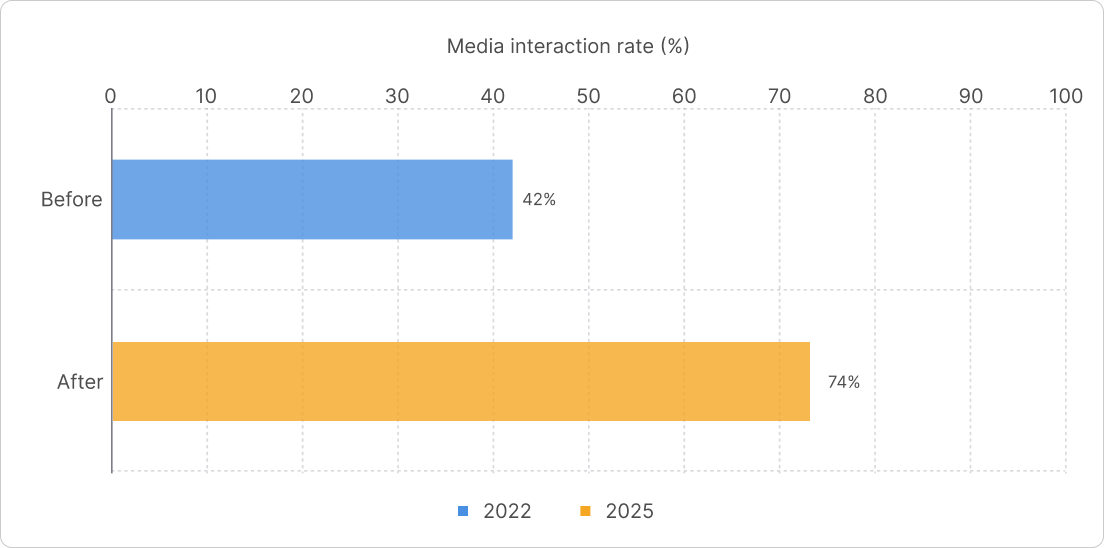
After launching Content View, we observed measurable improvements in user interaction and retention.
Key Metrics (first 30 days post-launch):in how often people interacted with media like photos, recordings, etc.
+ 25% increasein notebook revisit rates from Content View
- 42% dropin the time users spent searching for important content
+ 32% adoptionrate among users who use pill-based filters inside notebooks
To help users easily find their important content like photos, recordings, and bookmarks without having to search through multiple notebooks.
Competitive Research
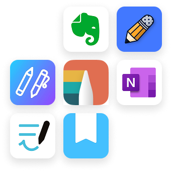
We looked at 4–5 other top note-taking apps, and none of them offered a feature like Content View. While most apps let you take notes or add media, they don’t help users easily find that media later, especially not across multiple notebooks
This made our feature truly stand out and helped shape Noteshelf 3 into a more thoughtful, user-first experience.
User Research
We started by collecting data from our user base across the globe. Using in-app surveys and Zendesk tickets, we got input from over 1,000 users. Our users ranged from students and professionals to creatives and researchers We asked simple, targeted questions like:
- "Do you struggle to find old media inside your notes?"
- "What kind of content do you add most to your notes—photos, recordings, or bookmarks?"
- "Would you use a search or filter option if available inside notebooks?"
We also analyzed usage patterns from app analytics and user session recordings, and looked closely at real user feedback from Zendesk and survey responses. Below are some actual requests and pain points from users, collected via Zendesk and our user survey.
Our Users
Primary UsersWe created 3 key personas based on real user interviews and common goals:

Rachel, 19 - The Student
Undergraduate science student who uses Noteshelf for lecture notes, snapshots of whiteboards, and audio recordings
user need “I need to quickly revisit lecture photos or recordings while I’m revising for exams”
Zack, 42 - The Therapist
A mental health therapist who uses the app for private client session notes
user need “I need a reliable way to tag, bookmark, and access my notes securely whenever I come back to them”
Meera, 29 - The Hobbyist
A lifestyle blogger who journals and collects inspiration through photos and recordings
user need “I love organizing mood boards, but it's such a pain trying to find older content in all my notebooks”User Pain Points
- No centralized access to visual or audio content across notebooks
- Time-consuming to open multiple notebooks just to find one piece of information
- Users had no visibility into where content types (photos, audio, etc.) were located
- Lack of efficient filtering inside notebooks for quickly narrowing down content
Our Solution: Content View
- Photos, Recordings, Bookmarks, Tags each get their own view
- Each item displays a preview + notebook name below
- Tapping on an item jumps directly to that page in the corresponding notebook.
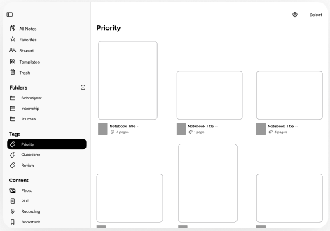
- Inside the thumbnail (finder) view of any notebook, we added “content pills”
- Pills for Photos, Recordings, Bookmarks, Stickers, Tags, Web Clips act as filters
- Tapping a pill shows only pages with that content type, instantly
“Want to see all photos in this notebook? Just tap the ‘Photos’ pill”
Initial Wireframes
Before jumping into visuals, I started off by sketching out rough wireframes in Figma. This helped me figure out how Content View could feel intuitive and lightweight, even though it was solving a pretty big problem. These early layouts gave me space to play around with structure and flow before getting into the details
Final Designs
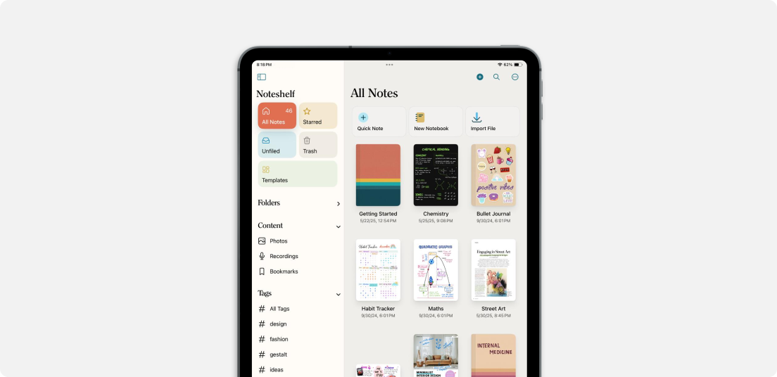
Here’s where it all starts. On the home screen, there’s a new “Content View” section that shows a quick preview of Photos, Recordings, Bookmarks, and Tags. The best part? Tapping on any of them takes you straight to the notebook page it is located.
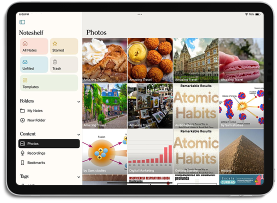
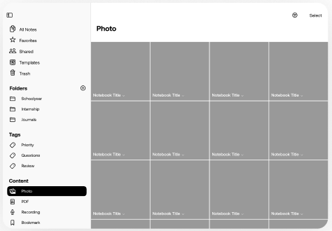
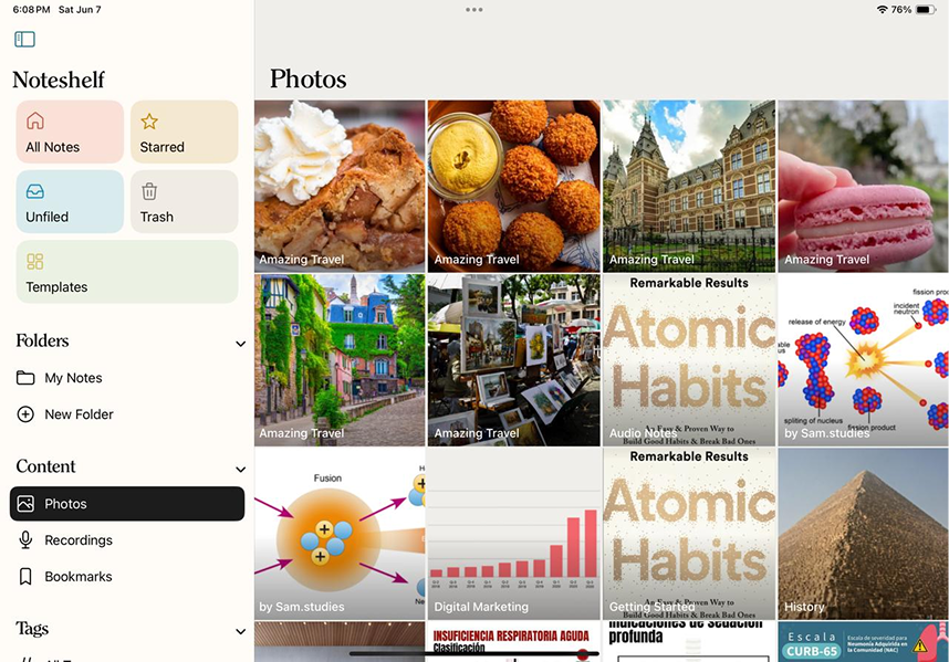
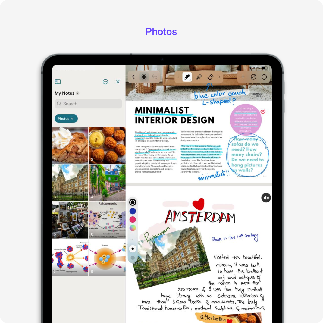
All photos from across notebooks appear in one visual grid. Tapping on a photo takes users straight to the notebook and exact page it's on.
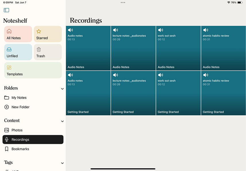
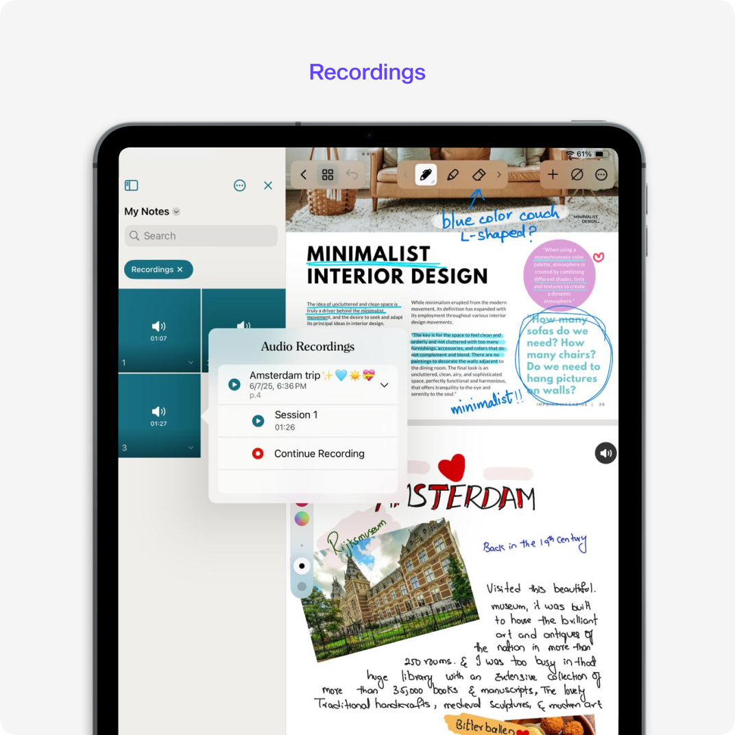
Same idea here - recordings are displayed in a grid with short previews. Tapping a recording leads to the page where it was recorded, helping users jump right into the context
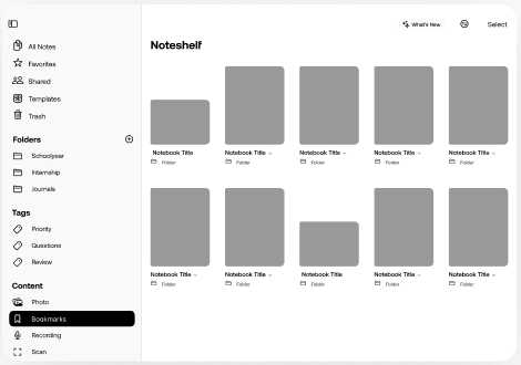
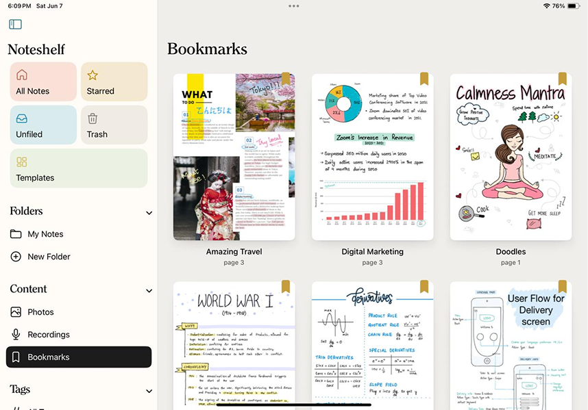
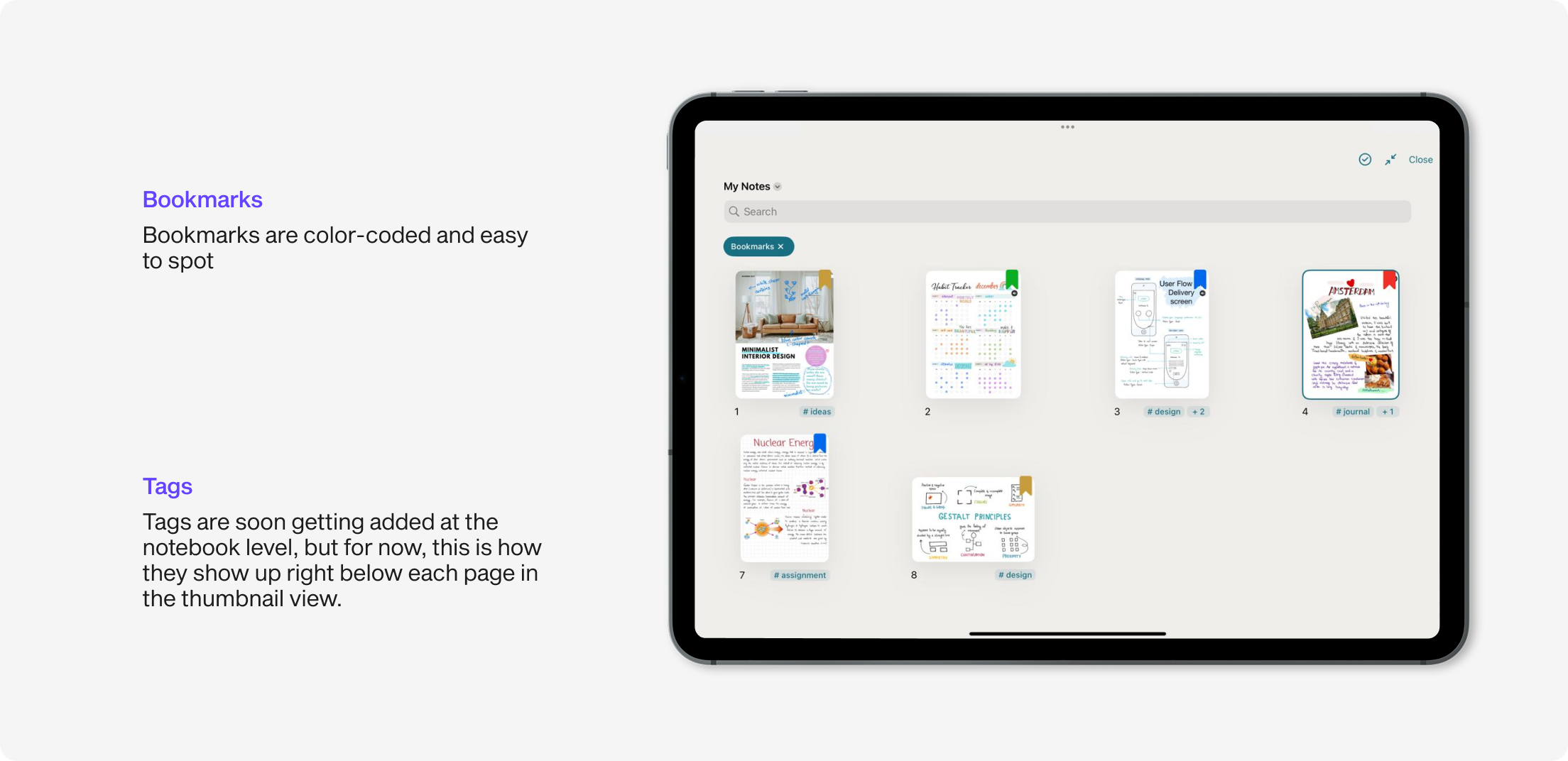
Bookmarks were always useful, but kinda hidden. Now, they have their own home. Users can see all bookmarked pages at a glance, organized and with color-coded labels. Each one is interactive and takes the user to the corresponding notebook page
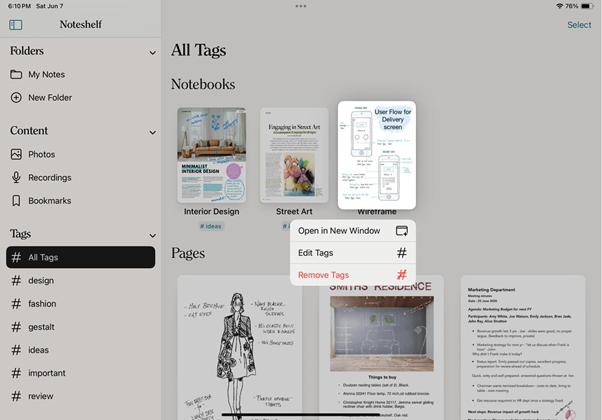
Tags are super flexible now. Users can tag pages and even entire notebooks. This view shows all the tags in one place, and you they easily edit them or jump to tagged content directly. It’s a small change that makes a big difference
After designing the global content view, we also brought similar visibility into individual notebooks. We wanted users to easily find what they’re looking for, even when deep inside a notebook.
In the thumbnail (finder) view, we added smart filters (pills) for:Photos, Recordings, Bookmarks & Tags (soon to be implemented)
Usability Testing
Before final release, we shared the build with a small group of beta users from different backgrounds. We asked them to try everyday actions, like finding a photo or jumping to a bookmarked page and watched how easily they could complete the tasks.
Their feedback helped us polish details and validate that the feature truly made things easier.
“The pills in the notebook view are a game-changer. I can finally filter just the pages I need.”
“Love seeing all my recordings in one place. So quick to review lectures now”
“Finally, one app that does everything! I could login, find my books and start studying & annotating without any confusion”
QA Testing
Throughout the build, we did multiple rounds of internal reviews to ensure everything felt just right. If the flow or animations didn’t feel smooth, we flagged them. I’d record quick videos or take screenshots, drop them in Notion, and the devs would fix them right away. Once the fixes were in, we’d run another round of checks until everything clicked.
What I Learned
- Discoverability is not just about search, it’s about visibility. Users didn’t just need a better search bar—they needed visual, intuitive ways to jump to content.
- Small touches make a big difference. Showing the notebook name below each item helped users trust where they were going
- Good design is backed by data. We used metrics and feedback at every stage to confirm we were solving the right problems
Future
Bug Fixes
Throughout the build, we did multiple rounds of internal reviews to ensure everything felt just right. If the flow or animations didn’t feel smooth, we flagged them. I’d record quick videos or take screenshots, drop them in Notion, and the devs would fix them right away. Once the fixes were in, we’d run another round of checks until everything clicked.
Listening to Feedback
Once the feature was out in the world, we kept an eye on how people were using it. Feedback from users helped us spot small issues and better understand where things could feel smoother. Those little insights went a long way in helping us improving the experience
Continuous Improvements
The goal is to keep polishing things. Small changes here and there that add up to a smoother, more useful experience.
Conclusion
The Content View in Noteshelf 3 became a core feature for improving navigation, saving time, and enhancing content discoverability. By bridging the gap between content and context, we gave users the control they needed to find exactly what they were looking for fast.
This was one of those projects that felt both challenging and creatively fulfilling. I got to design something that truly helped users, while also diving into the kind of problem-solving I love most. Seeing it go live and knowing it made a real difference for people? That’s the best part.
Thank you for reading through! Hope you enjoyed seeing how this feature came to life :)